


Mobile apps come in all designs, variations, and ideas to solve a consumer problem. While few apps end up being a replica of some other successful app, apps try to be different in their approaches of solving a problem for the end-user. At the end of the day, the primary goal is to satisfy the needs of their users and keep providing them the best user experience so that they come back.
In this journey, the end-user is on the lookout to find value immediately. There’s not much time that they give the app - 3/4th of them leave within 24 hours of installation. So, think how much they are going to be active on the app.. 24 hours? Definitely not. So what are the top reasons for this drop-off before finding value?
- When they don’t find the functionality/feature they were looking for - Hidden feature
- When they don’t know how to use the app/feature - No tutorials or guidance
- When it’s taking them too long to use the app or has multiple steps to reach a feature - Complex feature usage
- Too much confusion in the app’s design
- Spam attacks
- Intrusive ads or feature promotions
Each of these issues can be dealt with multiple iterations of product design and development. A low effort - high return mechanism of improving user experience is with minimalistic smart in-app nudging.
What are Smart Nudges?
In-app nudges serve as a helper or a guide in the app without even the user feeling intrusive. They are these small tooltips, coach marks, spotlights or attention grabbing banners, which guide users to do the actions you want them to do. When combined with data-driven intelligence, these nudges become your biggest growth hacks, as they can persuade your users to do exactly what you want them to.
Using dynamic in-app nudges is much more effective than a preloaded tutorial guide that’s hidden away in the help section of the app. It reduces the time taken for the user to reach the desired feature, and is a higher jump in getting value from the app. You don’t want to force a customer to do something they don’t want to do. Here, nudges attempt to positively influence your users in a direction you have predicted is better, given their state in the app.
.png)
The How, When and Which of Smart Nudges
Smart nudges would not work for you, unless you take the following things into account
When to nudge - what is the right moment to nudge users, which forms the Context
Whom to nudge - which users to nudge depending on the different stages of their app journey, which is the Person
How to nudge - finding the best suiting type of nudge for the scenario, which is the nudge Mechanism.
In this guide we look at various Nudge Mechanisms, and look at their applications in terms of Contextualization and Personalization.
User Onboarding for Product Guidance [Onboarding Walkthroughs]
A general issue that apps face is in hand holding customers during the initial stages of their life in the app. Many users come with an expectation that they want to use some feature or avail a discount in the app, make some purchase etc. Instead, when they install the app, they are bombarded with permissions, login screens and whatnot !
Finally, when they reach the homepage of the app, they are either left alone to swim across different parts of the app or they see so many messages on the app just telling what is where on the home-screen and that’s about it. Users are bound to get frustrated and leave the app. There’s your drop-off!
How to avoid this? Onboarding Walkthrough is one of the best ways to onboard users, where you take them through the app in a manner they get what they came for. The two essentials of this type of nudge are
- to understand what are the users in the app for,
- what is the selling point of the app which will enable them to get value
(i.e) Context and Value feature of the app.
Instead of showcasing features of lesser relevance, the most important or niche feature is to be given priority while onboarding the user on the app.
Another thing to keep in mind is, providing guidance only when needed.
This is more effective since the user is already aware of what he wants. But once he makes some action on the screen when he is not sure what to do, the app should be able to guide the user on what is available on the screen and help in redirection to the next steps in the journey.
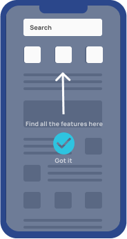
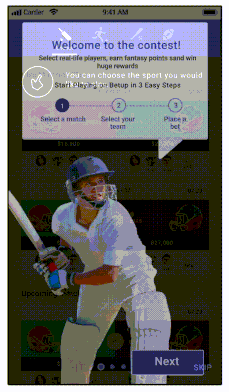
Example of an onboarding walkthrough in a gaming app
Here’s a sample onboarding walkthrough for a cricket fantasy gaming app. This 3 step walkthrough guides the users to understand how to kickstart their game, rather than scooting the users through all the features of the app. Conversion rates of such onboarding walkthroughs have been significantly higher than the traditional product tours.
Feature Discovery and Adoption [Spotlights, Tooltips, Passive Nudges]
“The failure of adopting features comes at a cost of $24,000,” estimates Michael Peach, Head of Product Marketing at Pendo, “if these were built across a 2-week sprint by a team of 6 developers”. “When you start to add that up, over sprints, over multiple features rolling out into larger feature sets within a product, that cost really begins to scale. If that feature is not being adopted or delivering value to the users, then that money is wasted,” he adds.
Features are built by development teams intensively after product managers do a full research on its need in the app. Indeed a lot of resources are invested. So the next task is to market the feature. Not just outside but inside the app as well.
Feature discovery drives adoption. There are 2 ways a feature can be discovered : One being the obvious way of replacing app flow to prioritize new features. This decision can go really good or haywire. It can go haywire because this completely breaks the user’s default flow, user’s are not going to realize the change until the tap and are prone to get disappointed. The smarter choice without causing much disruption is to place the feature in an appropriate place - could be the home screen or within any other layer in the app and nudge them towards a new feature. This can be complemented with the use of relevant and timed in app communication.
Display nudges like spotlights and tooltips can be informative and instructional. These nudges can convey information on what the feature is about or how to use it. Both can contain CTAs to make sure that the discovery happens in the app after nudging. Once discovered, the target is for adoption. Here using tooltips or coachmarks is not apt due to redundant information displaying. Instead, a passive red dot can do the job. This is going to drive users to check out the future when they know that it is there, but to familiarize and make it a habit.
We have compiled a complete guide to doing feature discovery the right way. Check it out here.
Example of Feature Discovery Nudge in Edtech App:
Leading edtech app Doubtnut, employed a feature discovery nudge, to showcase their under-utilized library feature. For this they created a Tooltip with an image and positioned it on top of the library feature in the home page.

Checkout the full story of how Doubtnut improved Feature Discovery and also their Conversions using feature discovery nudge.
In-App Announcements [In-App Messaging]
How many times have you faced a problem where you are busy doing your thing on the app, and all of a sudden there is an intrusive banner for an announcement that was not important at that moment interrupts your flow.
Banner messaging in apps is one of the most attention seeking ways for conveying information to users. Hence, it is important to show important information at the right time for it to get consumed rather than just displaying it for namesake, which would cause a disruption in the users’ natural flow on the app.
Hence, when it comes to in-app messages, timing and context play the most important role in their success or failure.
The essential aspect for a good banner message communication is - Minimal use of words. Since the entire screen is already grabbed for attention, cramping the space with a dump of words won’t help. Users won’t read, and there’s a high probability that it will go unnoticed.
Instead make the message short, strong and sharp!
Right call to action / redirection is the next step in creating the perfect in-app message. The message’s promise should be kept up in the CTA. It only makes the user happy when what he sees in the banner is shown to him immediately after clicking the desired button instead of making him wait or make him click more. Relevance of the banner to the user - both information wise and timing is also critical to make sure that the nudge is effective 100 %.
The greater you personalize your in-app messages, the higher are the chances of the nudge being used for its purpose.
Drop Off Journey Recovery [Surveys]
Take an instance when you as product manager at Uber see a pattern where users are booking a cab after giving a discount coupon. Users have entered the destination and while entering the coupon code, there is a surge in the drop off. As a product manager, you might tend to bias your decision towards the coupon code not working and that’s why there’s a surge in drop off.
Here, instead of assuming, the smart move would be to run a survey right to the point to find out exactly what went wrong. In-app Surveys allow you to get instant user feedback contextually and work on what end users face. The outcome of running surveys could help you find new insights like the reason for the drop off was due to a bug in displaying the success message after applying the coupon. Certain drop offs are hard to analyse quantitatively and that’s where qualitative surveys come to the rescue. Finding out the right reason for the drop off is critical for product iterations and will reduce the time taken to correct the app and launch appropriate fixes in the app.
To run the right kind of surveys, you need the right data points to track where the users drop off. Having the right data points will help in identifying the patterns of drop offs and user behaviours which lead to the drop off.
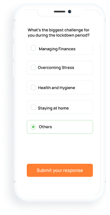
Here's a cool contextual survey created to understand user-sentiment during lockdown.
Smart Nudges - The elevated nudges for better user experience
While choosing the right nudge, designing it and giving it the right appeal is important for the user to tap and go ahead. The one element that remains constant to give users the motivation to tap on the nudge is the necessity to do so. Only when there’s a necessity for the user to check out more about what is being nudged, users will tap to find out more.
So how is the necessity identified?
It's the behavior of the user in the app that gives the context of what has to be done based on the past actions in the app.
Why is this essential?
Having the right context for nudging allows the user to reach the goal more easily than earlier. Almost 70% of the work is done when the right context is identified. The rest 30% is to implement the right nudge at the right feature such that the user realizes that what is being nudged is what he was looking for in the app.
How to identify the right context? The three areas that work like magic for nudging are
1. When the gold feature is not discovered
2. When there’s right ability for nudging in real time- instantaneously and contextually.
3. When there is mindless nudging - Where users are going to follow what is told to them unless it creates an impact on them. This works like a charm, but needs to be used at the right place.
Why is smart nudging in the right context important?
The right nudge increases the attention span of the user on the app and increases the engagement time. This increase eventually builds loyalty and improves retention. Context needn’t be the right time but also with the right users. Identifying the right target audience for experiment improves the quality of nudging.
Nudging at the right time with the right content to the right audience plays a crucial role in customer retention and churn. Knowing that you need to hand hold users until they are loyal is one part, but using the right way to nudge and the right type of nudge is another ball game which a lot of apps have not yet tapped into. This is the future of app communication which will change the way developers approach app design, and the way consumers use the app.
Signup with us to see smart in-app nudges live in action.


%201.webp)
